Alternatives representations detector#
- pdcleaner.plots.alternatives.plot(self, cmap=None, not_displayed_color='red', nfirst=0, nlast=0, figsize=None)[source]#
plot a countplot of values frequency grouped by keys, with options to compact the graph
- Parameters:
cmap (palette name (Default = Default matplotlib's palette)) – Should be something that can be interpreted by seaborn’s color_palette()
not_displayed_color (str, color name (Default = "red")) – Box color for the number of hidden values
nfirst (int) – Number of top n values to display
nlast (Bool (Default: True)) – Number of n last values to display
figsize ((float, float) (Default: None)) – width and height of the figure.
- Returns:
axs – matplotlib axes objects representing the plots
- Return type:
matplotlib.axes._subplots.AxesSubplot
- Raises:
ValueError if nfirst or nlast is <0 –
TypeError if nfirst or nlast is not an integer –
Examples
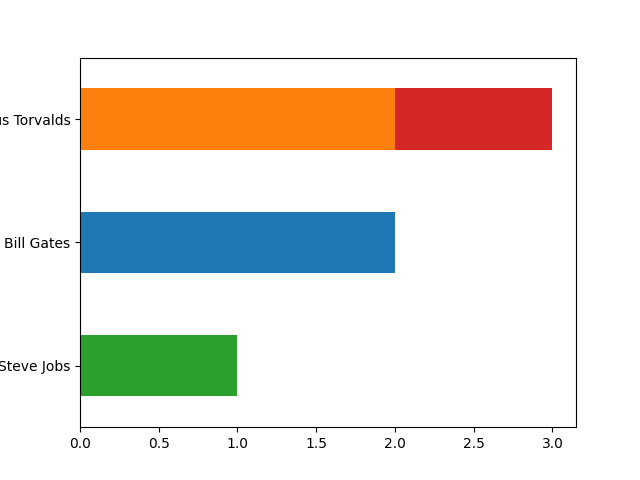
>>> series = pd.Series(['Linus Torvalds',
                           'Torvalds, Linus',
                           'Linus Torvalds',
                           'Bill Gates',
                           'Bill Gates',
                           'Steve Jobs',
                           ])
>>> detector = series.cleaner.detect.alternatives()
>>> detector.plot()
Display only the two most frequents
>>> detector.plot(nfirst=2)
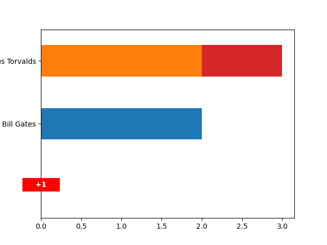
Display only the least frequent
>>> detector.plot(nlast=1)
